
目录
Introduction
1. Encoding
  1.1 Label Encoding using Scikit-learn
  1.2 One-Hot Encoding using Scikit-learn, Pandas and Tensorflow
2. Feature Hashing
  2.1 Feature Hashing using Scikit-learn
3. Binning / Bucketizing
  3.1 Bucketizing using Pandas
  3.2 Bucketizing using Tensorflow
  3.3 Bucketizing using Scikit-learn
4. Transformer
  4.1 Log-Transformer using Numpy
  4.2 Box-Cox Function using Scipy
5. Normalize / Standardize
  5.1 Normalize and Standardize using Scikit-learn
6. Feature Crossing
  6.1 Feature Crossing in Polynomial Regression
  6.2 Feature Crossing and the Kernel-Trick
7. Principal Component Analysis (PCA)
  7.1 PCA using Scikit-learn
Summary
References
引言
特征工程描述了制定相关特征的过程,以尽可能准确地描述基础数据科学问题,并使算法能够理解和学习模式。换句话说:
你提供的特征是向模型传达你对世界的理解和知识的一种方式。
每个特征描述了一种信息“片段”。这些片段的总和允许算法对目标变量做出结论,至少如果你有一个实际包含关于目标变量的信息的数据集。
根据福布斯杂志的报道,数据科学家花费大约80%的时间收集和准备相关数据,其中仅数据清理和数据组织就占用了大约60%的时间。
但这段时间是值得的。
我认为,数据的质量以及数据集特征的适当准备对机器学习模型的成功产生比ML管道中任何其他部分都更大的影响:

标准机器学习管道-取自[Sarkar et al., 2018]
福布斯杂志认为“清理和组织”通常在ML管道中分为两到三个子类别(我在上图中用黄色背景突出了它们):
(1) 数据(预)处理: 数据的初始准备-例如,平滑信号,处理异常值等。
(2) 特征工程: 为模型定义输入特征-例如,通过使用快速傅里叶变换(FFT)将(声学)信号转换为频域,我们可以从原始信号中提取关键信息。
(3) 特征选择: 选择对目标变量有重要影响的特征。通过选择重要特征并因此减少维度,我们可以显着降低建模成本并提高模型的鲁棒性和性能。
我们为什么需要特征工程?
Andrew Ng经常倡导所谓的数据中心方法,强调选择和策划数据的重要性,而不仅仅是试图收集更多数据。目标是确保数据具有高质量和与所解决问题的相关性,并通过数据清理,特征工程和数据增强不断改进数据集。
我们为什么需要特征工程和数据中心方法,当我们有深度学习时?
这种方法特别适用于成本高或其他方面难以收集大量数据的用例。[Brown, 2022]当数据难以访问或收集和存储大量数据存在严格的法规或其他障碍时,可能会出现这种情况,例如:
- 在制造业中,为生产设施配备全面的传感器技术并将其连接到数据库是昂贵的。因此,许多工厂根本不收集数据。即使机器能够收集和存储数据,它们也很少连接到中央数据湖。
- 在供应链上下文中,每家公司每天只有一定数量的订单要处理。因此,如果我们想预测对非常不规则需求的产品的需求,有时只有少数几个数据点可用。
在这些领域,特征工程可能具有提高模型性能的最大杠杆作用。在这里,工程师和数据科学家的创造力需要将数据集质量提升到足够的水平。这个过程很少是直截了当的,而是实验性的和迭代的。
当人类分析数据时,他们经常使用他们的过去知识和经验来帮助他们理解模式并进行预测。例如,如果有人试图估计不同国家的温度,他们可能会考虑国家相对于赤道的位置,因为他们知道温度在赤道附近往往更高。
然而,机器学习模型没有与人类相同的内在理解概念和关系。它只能从它所接收到的数据中学习。因此,人类用来解决问题的任何背景信息或上下文必须以数值形式明确包含在数据集中。
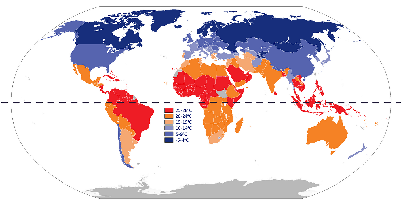
每个国家的年平均温度[Wikimedia]
所以,我们需要什么数据来使模型比人类更聪明?
我们可以使用Google Maps API查找每个国家的位置坐标(经度和纬度)。此外,我们可以收集有关每个国家地区的海拔高度和距离最近水体的信息。通过收集这些额外的数据,我们希望识别和考虑可能影响每个国家温度的因素。
假设我们已经收集了一些可能会影响温度的数据,接下来呢?
一旦我们收集了足够描述问题特征的数据,我们仍然必须确保计算机能够理解这些数据。例如,分类数据,日期等必须转换为数值。
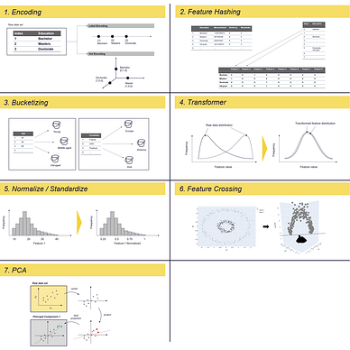
在本文中,我描述了几种常用的准备原始数据的技术。有些技术用于将分类数据转换为机器学习模型可以理解的数值,例如编码和向量化。其他技术用于解决数据分布问题,例如变压器和分箱,可以在某种程度上帮助规范或标准化数据。还有其他技术用于通过生成新特征来减少数据集的维数,例如哈希和主成分分析(PCA)。
自己试一试...
如果你想跟随这篇文章并尝试这些方法,你可以使用下面的仓库,其中包含在Jupyter Notebook中的代码片段和使用的数据集:
GitHub - polzerdo55862/7-feature-engineering-techniques
1. 编码
特征编码是一种将分类数据转换为机器学习算法可以理解的数字值的过程。有几种编码类型,包括标签编码和独热编码。

标签编码和独热编码 — 图片由作者提供
标签编码是将每个分类值分配一个数字值的过程。如果分类值之间有内在的顺序,例如从A到F的成绩,可以将其编码为从1到5(或6)的数字值。然而,如果分类值之间没有内在的顺序,标签编码可能不是最好的方法。
相反,你可以使用独热编码将分类值转换为数字值。在独热编码中,分类值的列被分成几个新列,每个唯一的分类值对应一个新列。
例如,如果分类值是从A到F的成绩:
- 我们将有五个新列,每个列对应一个成绩。
- 数据集中的每一行在其对应成绩的列中都有一个值为1,而其他列中的值都为0。
- 这会导致所谓的稀疏矩阵,其中大多数值为0。
独热编码的缺点是它可以显著增加数据集的大小,如果你想要编码的列包含数百或数千个唯一的分类值,则可能会出现问题。
接下来我将使用Pandas、Scikit-learn或Tensorflow将标签编码和独热编码应用于你的数据集。对于下面的示例,我们使用Census Income数据集:
数据集:人口普查收入 [许可证:CC0:公共领域]
https://archive.ics.uci.edu/ml/datasets/census+income
https://www.kaggle.com/datasets/uciml/adult-census-income
人口普查收入数据集描述了美国个人的收入情况。它包括他们的年龄、性别、婚姻状况和其他人口统计信息以及他们的年收入,分为两个类别:50,000美元以上或50,000美元以下。
对于标记示例,我们使用人口普查数据集的“教育”列,该列描述了人口中个体达到的最高教育水平。它包含诸如个体是否完成高中、完成大学、获得研究生学位或其他形式的教育等信息。
首先,让我们加载数据集:
import pandas as pd

# load dataset - census income
census_income = pd.read_csv(r'../input/income/train.csv')
1.1 使用Scikit-learn进行标签编码
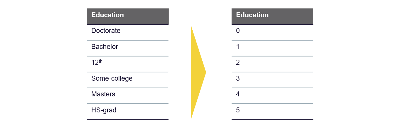
标签编码是将分类值转换为数字值的最简单方法。这是一个简单的过程,将每个分类值分配一个数字值。
标签编码 — 图片由作者提供
你可以在Pandas、Scikit-Learn和Tensorflow中找到适合的库。我使用Scikit-Learn的Label Encoder函数。它随机分配整数给唯一的分类值,这是编码的最简单方式:
from sklearn import preprocessing

# define and fit LabelEncoder
le = preprocessing.LabelEncoder()
le.fit(census_income["education"])

# Use the trained LabelEncoder to label the education column
census_income["education_labeled"] = le.transform(census_income["education"])

display(census_income[["education", "education_labeled"]])

这种编码方式可能会对某些算法造成问题,因为分配的整数不一定反映任何类别之间的内在顺序或关系。例如,在上述情况下,算法可能会认为类别Doctorate(10)和HS-grad(11)之间的相似性更大,而不是类别Doctorate(10)和Bachelor(9),而HS-grad(11)比Doctorate(10)更“高”。
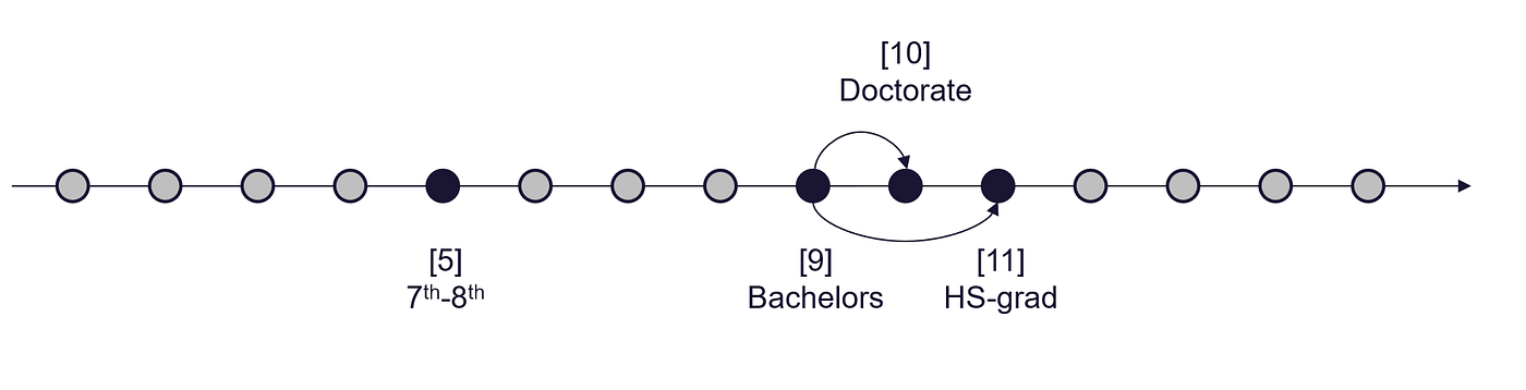
标签编码结果解释 — 图片由作者提供
如果我们对数据集的特定领域或主题有一些了解,我们可以使用它来确保标签编码过程反映任何内在顺序。对于我们的示例,我们可以尝试根据获得不同学位的顺序来标记教育水平,例如:
博士学位是比硕士和学士学位更高的学位。硕士学位比学士学位更高。
 ```
应用手动映射到数据集时,我们可以使用_pandas.map_函数:
```
应用手动映射到数据集时,我们可以使用_pandas.map_函数:
education_labels = {'Doctorate':5, 'Masters':4, 'Bachelors':3, 'HS-grad':2, '12th':1, '11th':0}

census_income['education_labeled_pandas']=census_income['education'].map(education_labels)

census_income[["education", "education_labeled_pandas"]]

但这会如何影响模型构建过程呢?
让我们使用标记编码的数据构建一个简单的线性回归模型:
对于下面的图,目标变量被定义为“个人收入超过5万美元的概率”。
- 在左图中,分类值(如“学士”和“博士”)已随机分配给数字值。
- 在右图中,分配给分类值的数字值反映了通常获得学位的顺序,较高的教育学位被分配较高的数字值。
→ 右图显示了教育水平和收入之间的明显相关性,可以用简单的线性模型表示。
→ 相反,左图显示了教育属性和目标变量之间的关系,这需要一个更复杂的模型来准确表示。这可能会影响结果的可解释性,增加过度拟合的风险,并增加拟合模型所需的计算量。
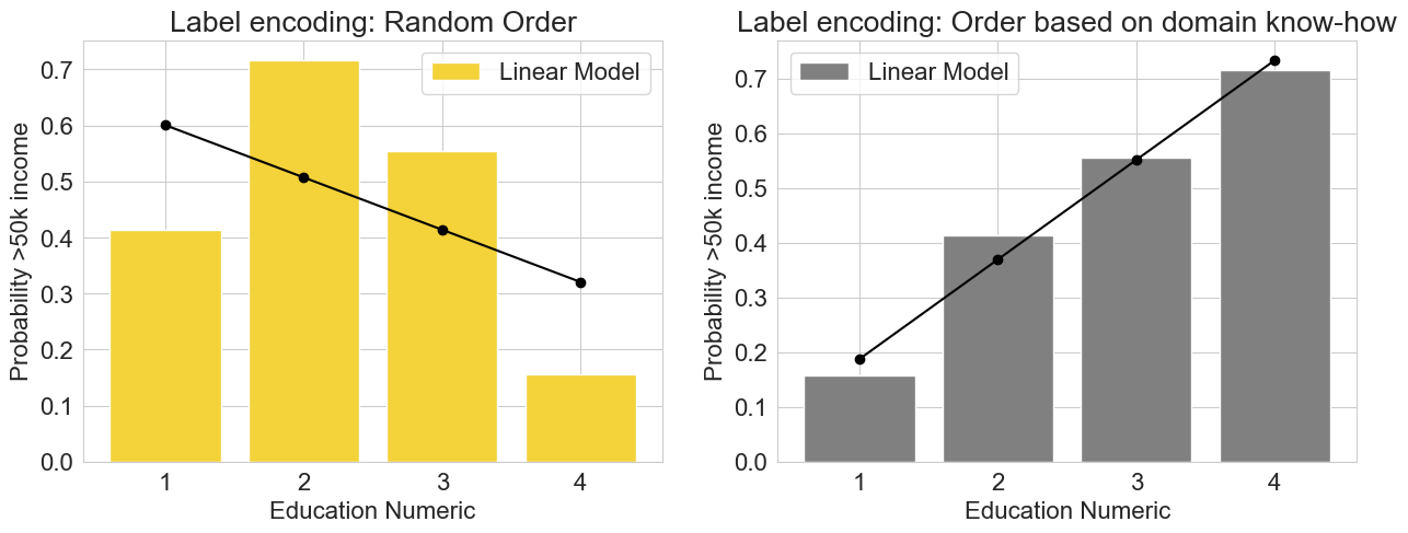
标签编码: 在有序和无序的“教育”特征上训练的线性回归模型 - 图片由作者提供
当值没有内在顺序或我们没有足够的信息进行映射时,我们该怎么办?
如果分类值根本没有内在顺序,可能最好使用一种编码方法,将类别转换为一组数值变量,而不引入任何偏差。独热编码是一种合适的方法。
1.2 使用Scikit-learn、Pandas和Tensorflow进行独热编码
独热编码是一种将分类数据转换为数值数据的技术。它通过为数据集中的每个唯一类别创建一个新的二进制列,并将值为1的行分配给属于该类别的行,将值为0的行分配给不属于该类别的行来实现此目的。
→ 这个过程通过不假设类别之间存在任何内在顺序来帮助避免引入偏差。
独热编码 - 图片由作者提供
独热编码的过程非常简单。我们可以自己实现它,也可以使用现有函数之一。Scikit-learn有**.preprocessing.OneHotEncoder()函数,Tensorflow有.one_hot()函数,Pandas有.get_dummies()**函数。
- Pandas.get_dummies()
import pandas as pd

education_one_hot_pandas = pd.get_dummies(census_income["education"], prefix='education')
education_one_hot_pandas.head(2)
- Sklearn.preprocessing.LabelBinarizer()
from sklearn import preprocessing

lb = preprocessing.LabelBinarizer()
lb.fit(census_income["education"])

education_one_hot_sklearn_binar = pd.DataFrame(lb.transform(census_income["education"]), columns=lb.classes_)
education_one_hot_sklearn_binar.head(2)
- Sklearn.preprocessing.OneHotEncoder()
from sklearn.preprocessing import OneHotEncoder

# define and fit the OneHotEncoder
ohe = OneHotEncoder()
ohe.fit(census_income[['education']])

# transform the data
education_one_hot_sklearn = pd.DataFrame(ohe.transform(census_income[["education"]]).toarray(), columns=ohe.categories_[0])
education_one_hot_sklearn.head(3)
独热编码的问题在于它可能导致高维稀疏数据集。
将具有10,000个唯一值的分类特征使用独热编码转换为数值数据将在数据集中创建10,000个新列,每个列表示不同的类别。当处理大型数据集时,这可能是一个问题,因为它可能会快速消耗大量的内存和计算资源。
如果内存和计算机性能有限,则可能需要减少数据集中的特征数量,以避免遇到内存或性能问题。
如何减少维数以节省内存?
在这样做时,重要的是要尽可能地减少信息损失。这可以通过仔细选择要保留或删除的特征,使用诸如特征选择或降维等技术来识别和删除冗余或不相关的特征来实现。[Sklearn.org][Wikipedia, 2022]
在本文中,我将介绍两种可能的方法来减少数据集的维数:
- 特征哈希 - 参见第2节. 特征哈希
- 主成分分析(PCA) - 参见第7节. PCA
信息损失 vs. 速度 vs. 内存
在数据集中减少维数可能没有一个“完美”的解决方案。一种方法可能更快,但可能会导致丢失大量信息,而另一种方法保留更多信息,但需要大量的计算资源(这也可能导致内存问题)。
2. 特征哈希
特征哈希主要是一种降维技术,通常用于自然语言处理。然而,哈希在我们想要将具有数百个和数千个唯一类别的分类特征向量化时也很有用。使用哈希,我们可以通过将多个唯一值分配给相同的哈希值来限制维度的增加。
→ 因此,哈希是独热编码和其他特征向量化方法的低内存替代方法。
哈希的工作原理是将哈希函数应用于特征,并直接使用哈希值作为索引,而不是构建哈希表并单独查找索引。Sklearn中的实现基于Weinberger [Weinberger et al., 2009]。
我们可以将其分解为2个步骤:
- **第1步:**首先使用哈希函数将分类值转换为哈希值。Scikit-learn中的实现使用32位MurmurHash3。
 哈希技巧——作者的图片
import sklearn
import pandas as pd

# load data set
census_income = pd.read_csv(r'../input/income/train.csv')
education_feature = census_income.groupby(by=["education"]).count().reset_index()["education"].to_frame()

############################################################################################################
# Apply the hash function, here MurmurHash3
############################################################################################################
def hash_function(row):
    return(sklearn.utils.murmurhash3_32(row.education))

education_feature["education_hash"] = education_feature.apply(hash_function, axis=1)
education_feature
- 步骤2:接下来,我们通过对特征值应用mod函数来降低维度。使用mod函数,我们计算哈希值除以n_features(输出向量的特征数)的余数。
建议将n_features参数设为2的幂;否则,特征将无法均匀映射到列。
示例:人口普查收入数据集→对“教育”列进行编码
人口普查收入数据集的“教育”列包含16个唯一值:
- 使用one-hot编码,将添加16个列到数据集中,每个列代表其中一个16个唯一值。
→为了降低维度,我们将n_features设置为8。
这必然会导致“碰撞”,即不同的分类值映射到相同的哈希列中。换句话说,我们将不同的值分配给同一个桶。类似于我们在分箱/桶化(参见第3节。分箱/桶化)中所做的。在特征哈希中,我们通过将分配给同一个桶的值简单地链接并将其存储在列表中(称为“单独链接”)来处理碰撞。
特征哈希:通过计算余数作为新列索引来降低维度 — 作者的图片
############################################################################################################
# Apply mod function
############################################################################################################
n_features = 8

def mod_function(row):
    return(abs(row.education_hash) % n_features)

education_feature["education_hash_mod"] = education_feature.apply(mod_function, axis=1)
education_feature.head(5)
一个可以为我们执行刚刚描述的步骤的函数是Scikit-learn的HashingVectorizer函数。
2.1 使用Scikit-learn进行特征哈希
sklearn.feature_extraction.text.HashingVectorizer
from sklearn.feature_extraction.text import HashingVectorizer

# define Feature Hashing Vectorizer
vectorizer = HashingVectorizer(n_features=8, norm=None, alternate_sign=False, ngram_range=(1,1), binary=True)

# fit the hashing vectorizer and transform the education column
X = vectorizer.fit_transform(education_feature["education"])

# transformed and raw column to data frame
df = pd.DataFrame(X.toarray()).assign(education = education_feature["education"])
display(df)
3. 分箱/桶化
分箱可用于分类和数值数据。顾名思义,目标是将特征的值映射到“箱子”中,并用代表该箱子的值替换原始值。
例如,如果我们有一个值范围从0到100的数据集,并且我们想将这些值分组为大小为10的箱子,我们可以为值0-9、10-19、20-29等创建箱子。
→在这种情况下,原始值将被替换为代表它们所属的箱子的值,例如10、20、30等。这有助于可视化和分析数据。
由于我们减少了数据集中唯一值的数量,因此可以帮助:
- 防止过拟合
- 增加模型的鲁棒性并减轻异常值的影响
- 减少模型复杂性和训练模型所需的资源
系统分箱可以帮助算法更轻松、高效地检测潜在的模式。如果我们在定义箱子之前已经可以形成假设,那么它尤其有用。
分箱可用于数值和分类值,例如:
分类和数值特征的分箱——作者的图片
接下来,我将使用三个示例来说明这可能看起来是什么样的,分别是数值和分类属性:
- **数值——**当构建流式推荐时,如何使用分箱——我在[Zheng、Alice和Amanda Casari。2018]的书《机器学习的特征工程》中发现的一个用例
- **数值——**人口普查收入数据集:应用于“年龄”列的分箱
- 分类—供应链中的分箱:根据目标变量将国家分配到箱子中
示例1:流式推荐系统——一首歌曲或视频有多受欢迎?
如果你想开发一个推荐系统,重要的是将歌曲的相对流行度分配数字值。其中最重要的属性之一是点击次数,即用户听歌的次数。
然而,一个听了1000遍歌的用户并不一定喜欢它的次数比听了50遍的用户多20倍。分箱可以帮助防止过拟合。因此,将歌曲的点击次数分成类别可能是有益的:[Zheng、Alice和Amanda Casari。2018]
点击次数 >=10:非常受欢迎
点击次数 >=2:受欢迎
点击次数 <2:中性,没有表述
示例2:年龄-收入关系
对于第二个示例,我再次使用人口普查收入数据集。目标是将个人分组为年龄段。
假设是一个人的具体年龄可能不会对他们的收入产生重大影响,而是他们所处的生活阶段。例如,还在上学的20岁人的收入可能与30岁的年轻专业人士不同。同样,60岁仍在全职工作的人的收入可能与70岁退休的人不同,而如果这个人是40或50岁,收入可能没有太大差别。## 3.1 使用 Pandas 进行分箱
为了按年龄对数据进行分箱,我定义了三个“桶”:
- 年轻 —— 28 岁及以下
- 中年 —— 29 到 59 岁
- 老年 —— 60 岁及以上
import matplotlib.pyplot as plt
import pandas as pd
import seaborn as sns

# creating a dictionary
sns.set_style("whitegrid")
plt.rc('font', size=16) #controls default text size
plt.rc('axes', titlesize=16) #fontsize of the title
plt.rc('axes', labelsize=16) #fontsize of the x and y labels
plt.rc('xtick', labelsize=16) #fontsize of the x tick labels
plt.rc('ytick', labelsize=16) #fontsize of the y tick labels
plt.rc('legend', fontsize=16) #fontsize of the legend

# load dataset - census income
census_income = pd.read_csv(r'../input/income/train.csv')

# define figure
fig, (ax1, ax2) = plt.subplots(2)
fig.set_size_inches(18.5, 10.5)

# plot age histogram
age_count = census_income.groupby(by=["age"])["age"].count()
ax1.bar(age_count.index, age_count, color='black')
ax1.set_ylabel("Counts")
ax1.set_xlabel("Age")

# binning age
def age_bins(age):
    if age < 29:
        return "1 - young"
    if age < 60 and age >= 29:
        return "2 - middle-aged"
    else:
        return "3 - old-aged"

# apply trans. function
census_income["age_bins"] = census_income["age"].apply(age_bins)

# group and count all entries in the same bin
age_bins_df = census_income.groupby(by=["age_bins"])["age_bins"].count()

ax2.bar(age_bins_df.index, age_bins_df, color='grey')
ax2.set_ylabel("Counts")
ax2.set_xlabel("Age")
3.2 使用 Tensorflow 进行分箱
Tensorflow 提供了一个名为feature columns的模块,其中包含一系列旨在帮助预处理原始数据的函数。Feature Columns 是将原始数据组织和解释为机器学习算法能够解释并用于学习的函数。[Google Developers, 2017]
TensorFlow 的feature_column.bucketized_columnAPI 提供了一种对数值数据进行分箱的方法。该 API 接受数值列并基于指定的边界创建一个分箱列。输入的数值列可以是连续或离散值。
import numpy as np
import pandas as pd
import tensorflow as tf
from tensorflow import feature_column
from tensorflow.keras import layers
# load dataset - census income
census_income = pd.read_csv(r'../input/income/train.csv')
data = census_income.to_dict('list')
# A utility method to show the transformation from feature column
def demo(feature_column):
feature_layer = layers.DenseFeatures(feature_column)
return feature_layer(data).numpy()
age = feature_column.numeric_column("age")
age_buckets = feature_column.bucketized_column(age, boundaries=[30,50])
buckets = demo(age_buckets)
# add buckets to the data set
buckets_tensorflow = pd.DataFrame(buckets)
# define boundaries for buckets
boundary1 = 30
boundary2 = 50
# define column names for buckets
bucket1=f"age<{boundary1}"
bucket2=f"{boundary1}<age<{boundary2}"
bucket3=f"age>{boundary2}"
buckets_tensorflow_renamed = buckets_tensorflow.rename(columns = {0:bucket1,
1:bucket2,
2:bucket3})
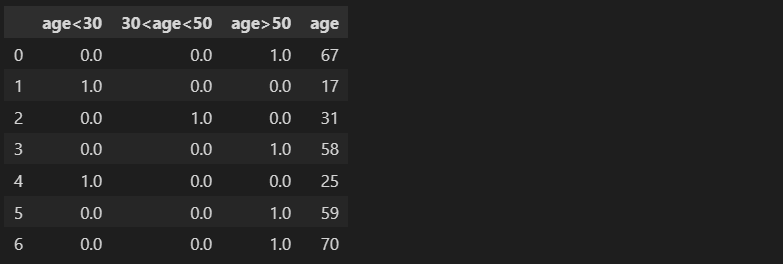
buckets_tensorflow_renamed.assign(age=census_income["age"]).head(7)
我们可以使用Scikit-learn中的KBinsDiscretizer来实现同样的功能。
3.3 使用 Scikit-learn 进行分箱
from sklearn.preprocessing import KBinsDiscretizer

# define bucketizer
est = KBinsDiscretizer(n_bins=3, encode='ordinal', strategy='uniform')
est.fit(census_income[["age"]])

# transform data
buckets = est.transform(census_income[["age"]])

# add buckets column to data frame
census_income_bucketized = census_income.assign(buckets=buckets)[["age", "buckets"]]
census_income_bucketized

下面是分类变量的一个例子...
没有一种通用的方法来将分类变量数字化。使用的适当方法取决于具体的用例和你想要向模型传达的信息。不同的编码方法可以突出数据的不同方面,选择最适合你特定用例需求的方法非常重要。
例 3:将分类值进行分箱 —— 如国家
供应链 —— 在评估供应商/分包商的可靠性时,诸如地区、气候和运输类型等因素会影响交货时间的准确性。在我们的资源规划系统中,我们通常存储供应商的国家和城市。由于某些国家在某些方面相似而在其他方面则完全不同,因此突出与用例相关的方面可能是有意义的。
- 如果我们想突出国家之间的距离并将国家分组到同一地区,我们可以为大洲定义桶。
- 如果我们更关心价格或可能的收入,则人均 GDP 可能更重要 → 在这里,我们可以将“高成本”国家(如美国、德国和日本)分组到一个桶中。
- 如果我们想突出一般的气候条件,我们可以将北方国家如加拿大和挪威放在同一个桶中。

使用不同属性对国家进行分箱的示例 —— 图片由作者提供
4. 转换器
转换技术是用于改变数据集的形式或分布的方法。一些常见的转换技术,例如对数或Box-Cox 函数,用于将不符合正态分布的数据转换为更对称且呈钟形曲线形状的形式。当数据需要符合某些统计模型或技术所需的某些假设时,这些技术可能会很有用。使用的特定转换方法可能取决于所需的结果和数据的特征。
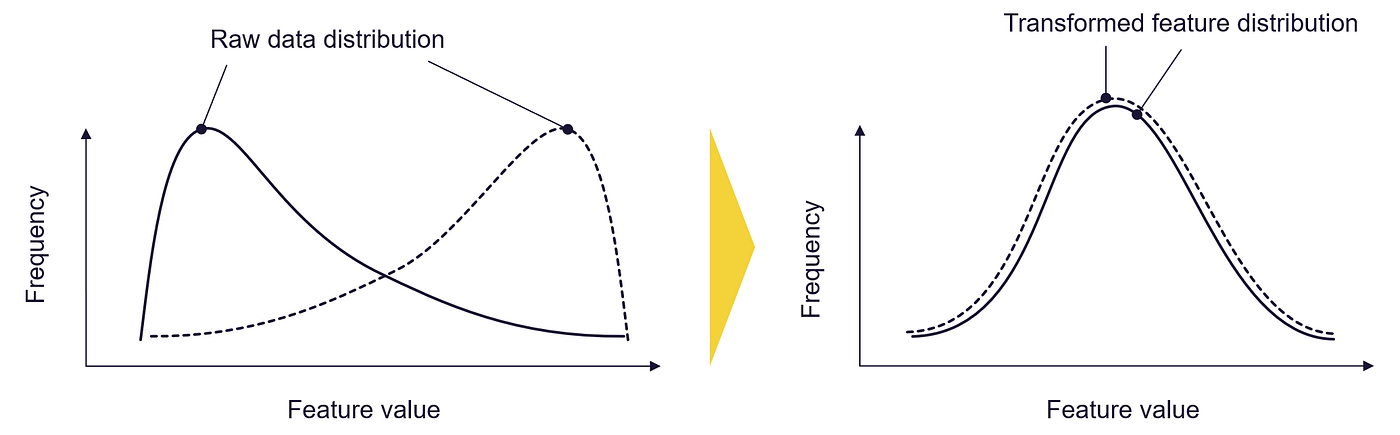
转换器:转换你的特征值分布 —— 图片由作者提供
4.1 使用 Numpy 进行对数转换
对数转换器用于通过将对数函数应用于每个值来更改数据的比例尺。这种转换通常用于将高度倾斜的数据转换为更接近正态分布的数据。
偏斜的数据绝非不寻常,各种情况下都存在自然或人为偏斜的数据,例如:
- 语言中单词使用的频率遵循称为Zipf 定律的模式
- 人类感知不同刺激的方式遵循由Stevens' power 函数描述的模式。
数据的分布不对称,可能存在长尾值,这些值比大多数数据要大得多或小得多。

正态分布与幂律分布对比 —— 图片由作者提供(受[Geeksforgeeks,2022]启发)
某些类型的算法可能难以处理此类数据,并可能产生不太准确或可靠的结果。应用幂转换,例如 Box-Cox 或对数转换,可以帮助调整数据的比例尺,并使其更适合这些算法使用。[Geeksforgeeks,2020]
让我们来看看转换器如何影响真实世界的数据。因此,我使用了世界人口、在线新闻热度和波士顿房屋数据集:
数据集 1:世界人口 [许可证:CC BY 3.0 IGO]
https://population.un.org/wpp/Download/Standard/CSV/
该数据集包含世界上每个国家的人口数量。[联合国,2022]
数据集 2:在线新闻热度 [许可证:CC0:公共领域]
https://archive.ics.uci.edu/ml/datasets/online+news+popularity
该数据集总结了 Mashable 在两年内发布的一组文章的各种特征。目标是预测社交网络上的分享数量(流行度)。
数据集 3:波士顿房屋数据集 [许可证:CC0:公共领域]
https://www.cs.toronto.edu/~delve/data/boston/bostonDetail.html
美国人口普查局在 1970 年代末和 1980 年代初收集了波士顿房下面的函数帮助我们绘制转换前后数据集的分布图:
import matplotlib.pyplot as plt
import pandas as pd
import numpy as np
from scipy import stats
import seaborn as sns

def plot_transformer(chosen_dataset, chosen_transformation, chosen_feature = None, box_cox_lambda = 0):
    plt.rcParams['font.size'] = '16'
    sns.set_style("darkgrid", {"axes.facecolor": ".9"})

    ##################################################################################################
    # choose dataset
    ##################################################################################################
    if chosen_dataset == "Online News Popularity":
        df = pd.read_csv("../input/uci-online-news-popularity-data-set/OnlineNewsPopularity.csv")
        X_feature = " n_tokens_content"
    elif chosen_dataset == "World Population":
        df = pd.read_csv("../input/world-population-dataset/WPP2022_TotalPopulationBySex.csv")
        df = df[df["Time"]==2020]
        df["Area"] = df["PopTotal"] / df["PopDensity"]
        X_feature = "Area"
    elif chosen_dataset == "Housing Data":
        df = pd.read_csv("../input/housing-data-set/HousingData.csv")
        X_feature = "AGE"

    # in case you want to plot the histogram for another feature
    if chosen_feature != None:
        X_feature = chosen_feature

    ##################################################################################################
    # choose type of transformation
    ##################################################################################################
    #chosen_transformation = "box-cox" #"log", "box-cox"

    if chosen_transformation == "log":
        def transform_feature(df, X_feature):
            # We add 1 to number_of_words to make sure we don't have a null value in the column to be transformed (0-> -inf)
            return (np.log10(1+ df[[X_feature]]))

    elif chosen_transformation == "box-cox":
        def transform_feature(df, X_feature):
            return stats.boxcox(df[[X_feature]]+1, lmbda=box_cox_lambda)
            #return stats.boxcox(df[X_feature]+1)

    ##################################################################################################
    # plot histogram to chosen dataset and X_feature
    ##################################################################################################
    # figure settings
    fig, (ax1, ax2) = plt.subplots(2)
    fig.set_size_inches(18.5, 10.5)

    ax1.set_title(chosen_dataset)
    ax1.hist(df[[X_feature]], 100, facecolor='black', ec="white")
    ax1.set_ylabel(f"Count {X_feature}")
    ax1.set_xlabel(f"{X_feature}")

    ax2.hist(transform_feature(df, X_feature), 100, facecolor='black', ec="white")
    ax2.set_ylabel(f"Count {X_feature}")
    ax2.set_xlabel(f"{chosen_transformation} transformed {X_feature}")

    fig.show()
在接下来的内容中,我们不仅测试了转换后的数据长什么样,还对模型构建过程中可能产生的影响感兴趣。我们使用多项式回归来构建简单的回归模型,并比较它们的性能。模型的输入数据仅为二维:
- 对于“仅新闻流行度”数据集,我们尝试构建一个基于在线文章“n_tokens”的“shares”预测模型——因此我们尝试构建一个基于文章标记数量/文章长度预测文章流行度的模型
- 对于“世界人口”数据集,我们构建一个简单的模型,该模型仅基于一个输入特征——国家面积——预测人口
示例1:世界人口数据集——国家面积
plot_transformer(chosen_dataset = "World Population", chosen_transformation = "log")

在图中,你可以看到原始分布向左倾斜,已转换为更对称的分布。
让我们尝试使用相同的方法来处理在线新闻流行度数据集:
示例2:基于文章长度的在线新闻流行度数据集
plot_transformer(chosen_dataset = "Online News Popularity", chosen_transformation = "log")
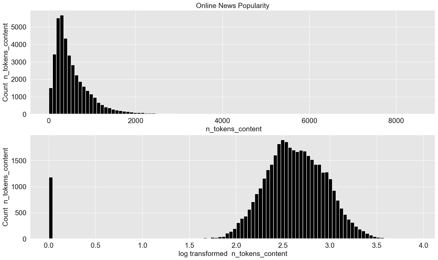
这个例子更好地展示了效果。偏斜的数据被转换为几乎“完美”的正态分布数据。
但是,这是否会对模型构建过程产生积极影响呢?为此,我创建了原始数据和转换后数据的多项式模型,并比较它们的性能:
import numpy as np
import matplotlib.pyplot as plt
from sklearn.pipeline import Pipeline
from sklearn.preprocessing import PolynomialFeatures
from sklearn.linear_model import LinearRegression
from sklearn.model_selection import cross_val_score
import plotly.graph_objects as go
import pandas as pd
from scipy import stats
import plotly.express as px
import seaborn as sns

def plot_cross_val_score_comparison(chosen_dataset):
    scores_raw = []
    scores_transformed = []
    degrees = []

    if chosen_dataset == "Online News Popularity":
        df = pd.read_csv("../input/uci-online-news-popularity-data-set/OnlineNewsPopularity.csv")
        X = df[[" n_tokens_content"]]
        y = df[" shares"]
    elif chosen_dataset == "World Population":
        df = pd.read_csv("../input/world-population-dataset/WPP2022_TotalPopulationBySex.csv")
        df = df[df["Time"]==2020]
        df["Area"] = df["PopTotal"] / df["PopDensity"]
        X = df[["Area"]]
        y = df["PopTotal"]

    for i in range(1,10):
        degree = i
        polynomial_features = PolynomialFeatures(degree=degree, include_bias=False)

        linear_regression = LinearRegression()
        pipeline = Pipeline(
            [
                ("polynomial_features", polynomial_features),
                ("linear_regression", linear_regression),
            ]
        )

        # Evaluate the models using crossvalidation
        scores = cross_val_score(
            pipeline, X, y, scoring="neg_mean_absolute_error", cv=5
        )


        scores_raw.append(scores.mean())
        degrees.append(i)

        #########################################################################
        # Fit model with transformed data
        #########################################################################
        def transform_feature(X):
            # We add 1 to number_of_words to make sure we don't have a null value in the column to be transformed (0-> -inf)
            #return (np.log10(1+ X))
            return stats.boxcox(X+1, lmbda=0)

        X_trans = transform_feature(X)

        pipeline.fit(X_trans, y)

        # Evaluate the models using crossvalidation
        scores = cross_val_score(
            pipeline, X_trans, y, scoring="neg_mean_absolute_error", cv=5
        )

        scores_transformed.append(scores.mean())

    plot_df = pd.DataFrame(degrees, columns=["degrees"])
    plot_df = plot_df.assign(scores_raw = np.abs(scores_raw))
    plot_df = plot_df.assign(scores_transformed = np.abs(scores_transformed))

    fig = go.Figure()
    fig.add_scatter(x=plot_df["degrees"], y=plot_df["scores_transformed"], name="Scores Transformed", line=dict(color="#0000ff"))

    # Only thing I figured is - I could do this
    #fig.add_scatter(x=plot_df['degrees'], y=plot_df['scores_transformed'], title='Scores Raw')
    fig.add_scatter(x=plot_df['degrees'], y=plot_df['scores_raw'], name='Scores Raw')

    # write scores for raw and transformed data in one data frame and find degree that shows the mininmal error score
    scores_df = pd.DataFrame(np.array([degrees,scores_raw, scores_transformed]).transpose(), columns=["degrees", "scores_raw", "scores_transformed"]).abs()
    scores_df_merged = scores_df[["degrees","scores_raw"]].rename(columns={"scores_raw":"scores"}).append(scores_df[["degrees", "scores_transformed"]].rename(columns={"scores_transformed":"scores"}))
    degree_best_performance = scores_df_merged[scores_df_merged["scores"]==scores_df_merged["scores"].min()]["degrees"]

    # plot a vertical line
    fig.add_vline(x=int(degree_best_performance), line_width=3, line_dash="dash", line_color="red", name="Best Performance")

    # update plot layout
    fig.update_layout(
        font=dict(
            family="Arial",
            size=18,  # Set the font size here
            color="Black"
        ),
        xaxis_title="Degree",
        yaxis_title="Mean Absolute Error",
        showlegend=True,
        width=1200,
        height=400,
    )

    fig['data'][0]['line']['color']="grey"
    fig['data'][1]['line']['color']="black"

    fig.show()
    return degree_best_performance
我知道这个简单的二维例子并不是一个代表性的例子,因为仅使用一个属性无法准确预测目标变量。但是,让我们看看是否可以从中得到任何有用信息。
让我们首先尝试使用在线新闻流行度数据集:
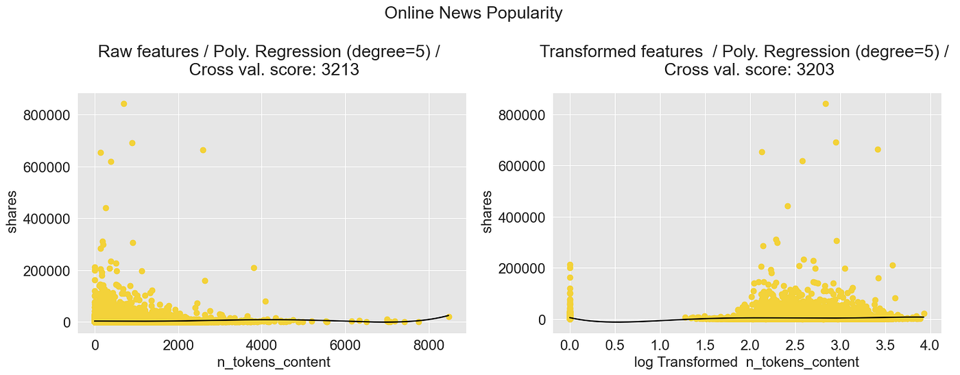
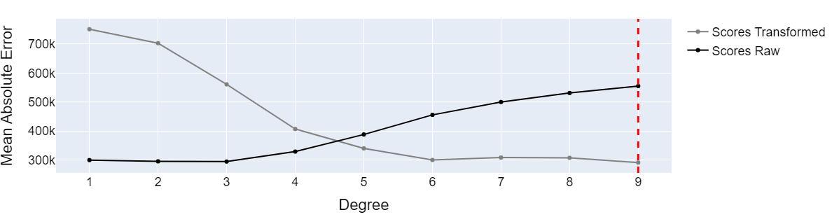
degree_best_performance_online_news = plot_cross_val_score_comparison(chosen_dataset="Online News Popularity")
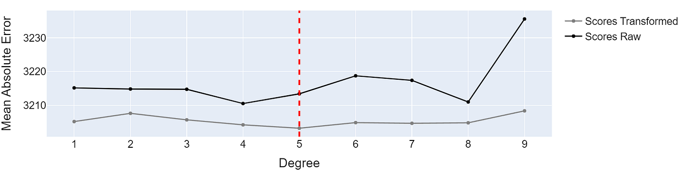
基于原始数据和转换后数据训练的多项式回归模型的性能 —— 图片由作者提供
在转换后的数据上训练的模型表现略好。虽然从3213到3202的绝对误差差异并不特别大,但它确实表明数据转换可能对训练过程产生积极影响。
通过绘制转换后的数据并构建模型,我们可以看到数据向右移动了。这给模型更多的“空间”来适应数据:
from sklearn.linear_model import LinearRegression
from sklearn.model_selection import cross_val_score
import matplotlib.pyplot as plt
import pandas as pd
from sklearn.preprocessing import PolynomialFeatures
from sklearn.linear_model import LinearRegression
from sklearn.pipeline import Pipeline
import numpy as np

def plot_polynomial_regression_model(chosen_dataset, chosen_transformation, degree_best_performance):
    # fig settings
    plt.rcParams.update({'font.size': 16})
    fig, ax = plt.subplots(nrows=1, ncols=2, figsize=(15, 6))

    if chosen_dataset == "Online News Popularity":
        df = pd.read_csv("../input/uci-online-news-popularity-data-set/OnlineNewsPopularity.csv")
        y_column = " shares"
        X_column = " n_tokens_content"
        X = df[[X_column]]
        y = df[y_column]
    elif chosen_dataset == "World Population":
        df = pd.read_csv("../input/world-population-dataset/WPP2022_TotalPopulationBySex.csv")
        df = df[df["Time"]==2020]
        df["Area"] = df["PopTotal"] / df["PopDensity"]
        y_column = "PopTotal"
        X_column = "Area"
        X = df[[X_column]]
        y = df[y_column]

    #########################################################################
    # Define model
    #########################################################################
    # degree_best_performance was calculated in the cell above
    degree = int(degree_best_performance)
    polynomial_features = PolynomialFeatures(degree=degree, include_bias=False)

    linear_regression = LinearRegression()
    pipeline = Pipeline(
        [
            ("polynomial_features", polynomial_features),
            ("linear_regression", linear_regression),
        ]
    )

    #########################################################################
    # Fit model
    #########################################################################
    pipeline.fit(X, y)

    ######################################################################################
    # Fit model and plot raw features
    ######################################################################################
    reg = pipeline.fit(X, y)
    X_pred = np.linspace(min(X.iloc[:,0]), max(X.iloc[:,0]),1000).reshape(-1,1)
    X_pred = pd.DataFrame(X_pred)
    X_pred.columns = [X.columns[0]]
    y_pred_1 = reg.predict(X_pred)

    # plot model and transformed data
    ax[0].scatter(X, y, color='#f3d23aff')
    ax[0].plot(X_pred, y_pred_1, color='black')
    ax[0].set_xlabel(f"{X_column}")
    ax[0].set_ylabel(f"{y_column}")
    ax[0].set_title(f"Raw features / Poly. Regression (degree={degree})", pad=20)

    #########################################################################
    # Fit model with transformed data
    #########################################################################
    def transform_feature(X, chosen_transformation):
        # We add 1 to number_of_words to make sure we don't have a null value in the column to be transformed (0-> -inf)
        if chosen_transformation == "log":
            return (np.log10(1+ X))
        if chosen_transformation == "box-cox":
            return stats.boxcox(X+1, lmbda=0)

    X_trans = transform_feature(X, chosen_transformation)

    # fit model with transformed data
    reg = pipeline.fit(X_trans, y)

    # define X_pred
    X_pred = np.linspace(min(X_trans.iloc[:,0]), max(X_trans.iloc[:,0]),1000).reshape(-1,1)
    X_pred = pd.DataFrame(X_pred)
    X_pred.columns = [X.columns[0]]

    # predict
    y_pred_2 = reg.predict(X_pred)

    # plot model and transformed data
    ax[1].scatter(X_trans, y, color='#f3d23aff')
    ax[1].plot(X_pred, y_pred_2, color='black')
    ax[1].set_xlabel(f"{chosen_transformation} Transformed {X_column}")
    ax[1].set_ylabel(f"{y_column}")
    # calc cross val score and add to title
    ax[1].set_title(f"Transformed features  / Poly. Regression (degree={degree})", pad=20)

    fig.suptitle(chosen_dataset)
    fig.tight_layout()
我们使用刚刚定义的函数来绘制表现最佳的多项式模型:
plot_polynomial_regression_model(chosen_dataset = "Online News Popularity", chosen_transformation = "log", degree_best_performance=degree_best_performance_online_news)
多项式回归模型:在线新闻分享 —— 图片由作者提供
让我们再试试“世界人口”数据集:
degree_best_performance_world_pop = plot_cross_val_score_comparison(chosen_dataset="World Population")
基于原始数据和转换后数据训练的多项式回归模型的性能 —— 图片由作者提供
我们可以看到,原始数据和转换后数据集之间的模型性能差异很大。虽然基于原始数据的模型在低多项式度数下表现显著优异,但在构建高多项式度数的模型时,基于转换后数据的模型表现更好。
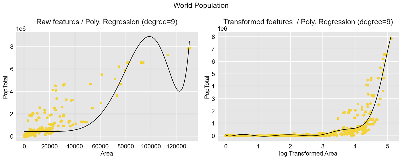
多项式回归模型:国家人口 —— 图片由作者提供
仅供比较,这是基于原始数据表现最佳的线性模型:
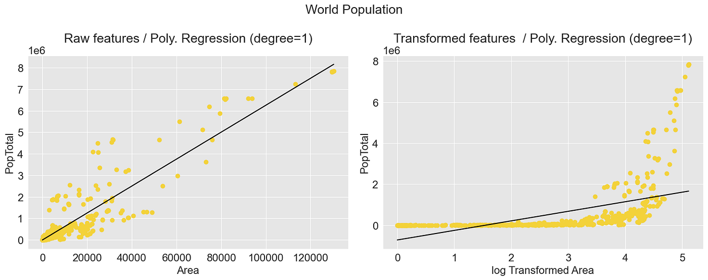
多项式回归模型:国家人口 —— 图片由作者提供
4.2 Scipy 中的 Box-Cox 函数
另一个非常流行的转换函数是 Box-Cox 函数,它属于幂变换器组。
幂变换器是一族参数变换,旨在将任何数据分布转换为正态分布的数据集,并最小化方差和偏斜。[Sklearn.org]
为了实现这种灵活的转换,Box-Cox 函数定义如下:

要使用 Box-Cox 函数,我们必须确定转换参数 lambda。如果你没有手动指定 lambda,转换器会尝试通过最大化似然函数来找到最佳的 lambda。[Rdocumentation.org] 可以在函数 scipy.stats.boxcox 中找到一个合适的实现。
注意:Box-Cox函数必须用于大于零的数据。
Box-Cox转换比对数转换更灵活,因为它可以产生各种转换形状,包括线性、二次和指数,这可能更适合数据。此外,Box-Cox转换可以用于转换正偏斜和负偏斜的数据,而对数转换只能用于正偏斜数据。
λ参数用于什么?
参数λ可以调整转换以适应所分析的数据的特征。λ的值为0会产生对数转换,而0到1之间的值会创建越来越“强”的转换。如果将λ设置为1,则该函数不会对数据执行任何转换。
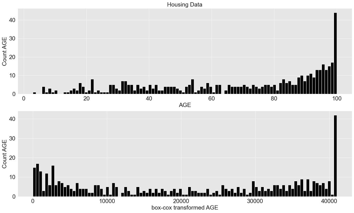
为了表明Box-Cox函数可以转换不仅是右偏的数据,我还使用了波士顿房屋数据集中的AGE(“1940年之前建造的自住单位比例”)属性。
import seaborn as sns

plot_transformer(chosen_dataset = "Housing Data", chosen_transformation = "box-cox", chosen_feature = None, box_cox_lambda = 2.5)
5. 归一化/标准化
归一化和标准化是机器学习中重要的预处理步骤。它们可以帮助算法更快地收敛,甚至可以增加模型的准确性。
5.1 使用Scikit-learn进行归一化和标准化
- Scikit-learn的MinMaxScaler将特征缩放到给定范围。它通过将每个特征缩放到0到1之间的给定范围来转换特征。
- Scikit-learn的StandardScaler将数据转换为具有0的平均值和1的标准差。
# data normalization with sklearn
from sklearn.preprocessing import MinMaxScaler, StandardScaler
import matplotlib.pyplot as plt
import pandas as pd
import seaborn as sns

plt.rcParams['font.size'] = '16'
sns.set_style("darkgrid", {"axes.facecolor": ".9"})

# load data set
census_income = pd.read_csv(r'../input/income/train.csv')

X = census_income[["age"]]

# fit scaler and transform data
X_norm = MinMaxScaler().fit_transform(X)
X_scaled = StandardScaler().fit_transform(X)

# plots
fig, (ax1, ax2, ax3) = plt.subplots(3)
fig.suptitle('Normalizing')
fig.set_size_inches(18.5, 10.5)

# subplot 1 - raw data
ax1.hist(X, 25, facecolor='black', ec="white")
ax1.set_xlabel("Age")
ax1.set_ylabel("Frequency")

# subplot 2 - normalizer
ax2.hist(X_norm, 25, facecolor='black', ec="white")
ax2.set_xlabel("Normalized Age")
ax2.set_ylabel("Frequency")

# subplot 3 - standard scaler
ax3.hist(X_scaled, 25, facecolor='black', ec="white")
ax3.set_xlabel("Normalized Age")
ax3.set_ylabel("Frequency")

fig.tight_layout()

6. 特征交叉
特征交叉是将数据集中的多个特征连接起来创建新特征的过程。这可以包括将来自其他来源的数据组合在一起以强调现有的相关性。
创意没有限制。首先,通过正确组合属性来使已知的相关性显现出来是有意义的,例如:
示例1:预测公寓价格
假设我们有一系列公寓要出售,并且有技术蓝图和公寓的尺寸可用。
为了确定公寓的合理价格,具体的尺寸可能不如总面积重要:一个房间是6m*7m还是5.25m*8m不如房间有42平方米重要。如果我只有尺寸a和b,那么添加面积作为特征也是有意义的。
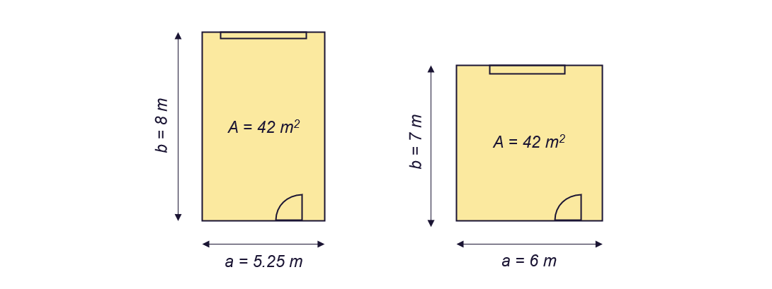
预测公寓价格 - 图片由作者提供
示例2:使用技术知识 - 预测铣床的能耗
几年前,我正在开发一个回归模型,可以预测铣床的能耗。
当为特定领域实现解决方案时,查看可用文献始终是值得的。由于人们有兴趣能够计算切割机的功率要求至少50年,因此我们可以使用50年的研究成果。
即使现有的公式只适用于粗略计算,我们也可以利用关于属性和目标变量(能耗)之间已知相关性的专业知识。在下图中,你可以看到功率需求和变量之间的一些已知关系。
→我们可以通过将切割宽度b和切割深度h(计算横截面积A)进行交叉,并将其定义为新特征来突出这些已知关系。这可以帮助训练过程,特别是如果我们使用较简单的模型。

铣床功率要求的计算 - 图片由作者提供
但我们不仅仅使用它来准备数据集,一些算法使用Feature Crossing作为它们工作的基本部分。
一些ML方法和算法默认使用特征交叉
两种使用特征交叉的知名ML技术是多项式回归和内核技巧(例如,与支持向量回归结合使用)。
6.1 多项式回归中的特征交叉
Scikit-learn不包含多项式回归函数,我们将其组合为:
- 特征转换步骤和
- 线性回归模型构建步骤。
通过组合和指数化特征,我们生成了几个新特征,这使得可以表示输出变量之间的非线性关系。
假设我们要使用2维输入矩阵X和目标变量y构建回归模型。除非明确定义,否则特征转换函数(sklearn.PolynomialFeatures)会将矩阵转换为以下形式:
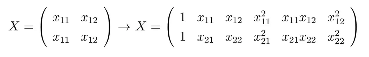 你可以看到新的矩阵包含了四列新属性。这些属性不仅被加强,还相互交叉:
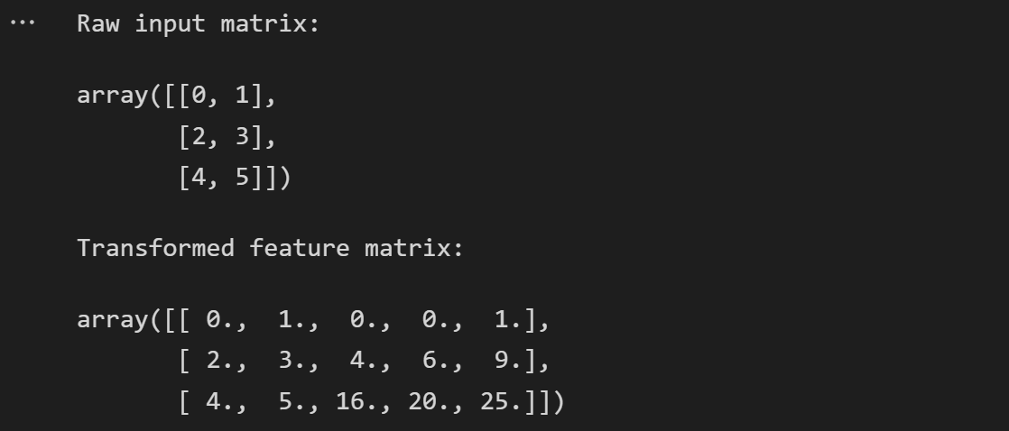
import numpy as np
from sklearn.preprocessing import PolynomialFeatures

# Raw input features
X = np.arange(6).reshape(3, 2)
print("Raw input matrix:")
display(X)

# Crossed features
poly = PolynomialFeatures(2)
print("Transformed feature matrix:")
poly.fit_transform(X)
这样我们就可以建立任何想象中的关系,只需选择合适的多项式次数。
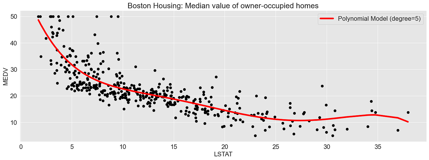
以下示例展示了一个多项式回归模型(多项式次数为5),该模型基于属性LSTAT(低收入人群的百分比)预测波士顿自住房屋的中位数价值。
from sklearn.preprocessing import PolynomialFeatures
from sklearn.linear_model import LinearRegression
from sklearn.pipeline import Pipeline

import matplotlib.pyplot as plt
import seaborn as sns
import pandas as pd

plt.rcParams['font.size'] = '16'
sns.set_style("darkgrid", {"axes.facecolor": ".9"})

# load data set: Boston Housing
boston_housing_df = pd.read_csv("../input/housing-data-set/HousingData.csv")
boston_housing_df = boston_housing_df.dropna()
boston_housing_df = boston_housing_df.sort_values(by=["LSTAT"])

# define x and target variable y
X = boston_housing_df[["LSTAT"]]
y = boston_housing_df["MEDV"]

# fit model and create predictions
degree = 5
polynomial_features = PolynomialFeatures(degree=degree)
linear_regression = LinearRegression()
pipeline = Pipeline(
    [
        ("polynomial_features", polynomial_features),
        ("linear_regression", linear_regression),
    ]
)
pipeline.fit(X, y)

y_pred = pipeline.predict(X)

# train linear model
regr = LinearRegression()
regr.fit(X,y)

# figure settings
fig, (ax1) = plt.subplots(1)
fig.set_size_inches(18.5, 6)

ax1.set_title("Boston Housing: Median value of owner-occupied homes")
ax1.scatter(X, y, c="black")
ax1.plot(X, y_pred, c="red", linewidth=4, label=f"Polynomial Model (degree={degree})")
ax1.set_ylabel(f"MEDV")
ax1.set_xlabel(f"LSTAT")
ax1.legend()

fig.show()
6.2 特征交叉和核技巧
特征交叉已经在内在地使用了核技巧中的另一个示例,例如支持向量回归。通过核函数,我们将数据集转换为更高维度的空间,这使得可以轻松地将类别相互分离。
对于下面的示例,我生成了一个二维数据集,在二维空间中很难相互分离,至少对于线性模型而言。
from sklearn.datasets import make_circles
from sklearn import preprocessing
import plotly_express as px
import matplotlib
import matplotlib.pyplot as plt
import seaborn as sns
import pandas as pd

sns.set_style("darkgrid", {"axes.facecolor": ".9"})
plt.rcParams['font.size'] = '30'

# generate a data set
X, y = make_circles(n_samples=1_000, factor=0.3, noise=0.05, random_state=0)
X = preprocessing.scale(X)

X=X[500:]
y=y[500:]

# define target value, here: binary classification, class 1 or class 2
y=np.where(y==0,"class 1","class 2")

# define x1 and x2 of a 2-dimensional data set
x1 = X[:,0]
x2 = X[:,1]

import plotly_express as px
# define the kernel function
kernel = x1*x2 + x1**2 + x2**2

circle_df = pd.DataFrame(X).rename(columns={0:"x1", 1:"x2"})
circle_df = circle_df.assign(y=y)

color_discrete_map = {circle_df.y.unique()[0]: "black", circle_df.y.unique()[1]: "#f3d23a"}
px.scatter(circle_df, x="x1", y="x2", color="y", color_discrete_map = color_discrete_map, width=1000, height=800)

# plot the data set together with the kernel value in a 3-dimensional space
color_discrete_map = {circle_df.y.unique()[0]: "black", circle_df.y.unique()[1]: "grey"}
fig = px.scatter(circle_df, x="x1", y="x2", color="y", color_discrete_map = color_discrete_map, width=1000, height=600)
fig.update_layout(
    font=dict(
        family="Arial",
        size=24,  # Set the font size here
        color="Black"
    ),
    showlegend=True,
    width=1200,
    height=800,
)

通过使用核技巧,我们生成了一个三维空间。对于此示例,核函数的定义为:

import plotly_express as px

# define the kernel function
kernel = x1*x2 + x1**2 + x2**2

kernel_df = pd.DataFrame(X).rename(columns={0:"x1", 1:"x2"})
kernel_df = kernel_df.assign(kernel=kernel)
kernel_df = kernel_df.assign(y=y)

# plot the data set together with the kernel value in a 3-dimensional space
color_discrete_map = {kernel_df.y.unique()[0]: "black", kernel_df.y.unique()[1]: "grey"}
px.scatter_3d(kernel_df, x="x1", y="x2", z="kernel", color="y", width=1000, height=600)
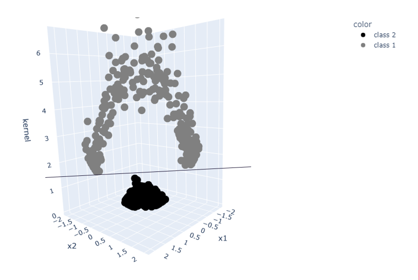
核技巧:一个二维数据集转换为一个三维空间 — 图片由作者提供
三维空间使得可以使用简单的线性分类器将数据分离。
7. 主成分分析(PCA)
主成分分析(PCA)通过创建从原始特征导出的一组新特征来减少数据集的维度。因此,类似于哈希,我们减少了数据集的复杂性,从而减少了计算所需的计算量。
此外,它可以帮助我们可视化数据集。具有多个维度的数据集可以在低维表示中进行可视化,同时尽可能保留原始变化。
在本节中,我将略过有关它如何工作的更深入解释,因为已经有一些关于此主题的优秀资源,例如:
- Josh Starmer: StatQuest: Principal Component Analysis (PCA), Step-by-Step
- Sebastian Raschka: Principal Component Analysis in 3 simple steps
以下是最重要的四个步骤:
- 标准化数据: 从每个特征中减去均值并将特征缩放到单位方差。
- 计算标准化数据的协方差矩阵: 此矩阵将包含所有特征之间的成对协方差。
- **计算协方差矩阵的特征向量和特征值:**特征向量确定新特征空间的方向并表示主要成分,特征值确定它们的大小。
- 选择主要成分: 选择前几个主要成分(通常是具有最高特征值的成分),并将它们用于将数据投影到较低维空间中。你可以根据要保留的方差量或要将数据降低到的维数选择要保留的成分。
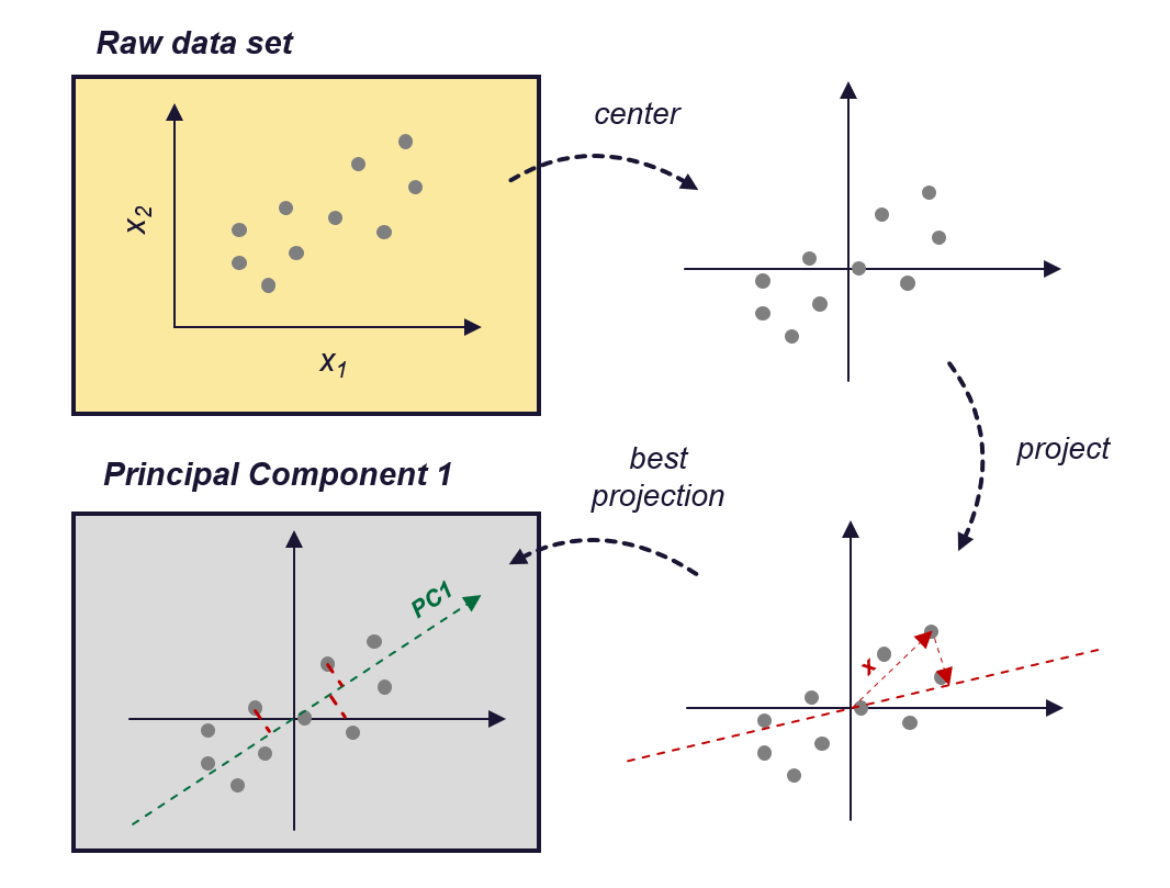
PCA的工作原理 — 图片由作者提供(受[Zheng,Alice和Amanda Casari,2018]的启发)
我将向你展示如何使用PCA使用鸢尾花数据集创建新特征。
数据集:Iris数据集 [许可证:CC0:公共领域]
https://archive.ics.uci.edu/ml/datasets/iris
https://www.kaggle.com/datasets/uciml/iris
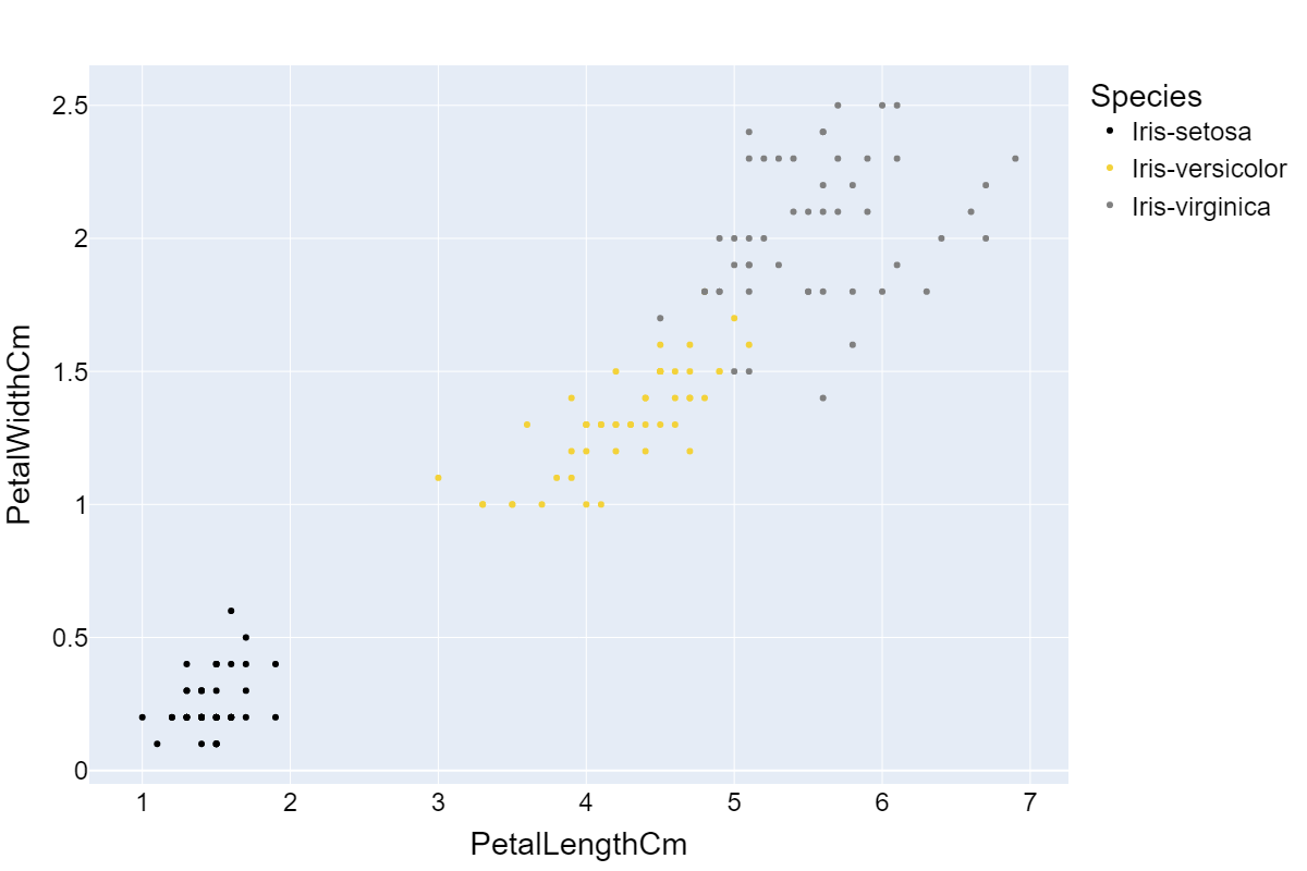
鸢尾花数据集是一个包含有关三种鸢尾花(Iris setosa,Iris virginica和Iris versicolor)的信息的数据集。它包括花萼和花瓣的长度和宽度(以厘米为单位)的数据,包含150个观测值。
因此,首先让我们加载数据集并查看四个维度(花萼长度,花萼宽度,花瓣长度,花瓣宽度)中数据的分布。
from matplotlib import pyplot as plt
import numpy as np
import seaborn as sns
import math

import pandas as pd

# Load the Iris dataset
iris_data = pd.read_csv(r'../input/iris-data/Iris.csv')
iris_data.dropna(how="all", inplace=True) # drops the empty line at file-end

sns.set_style("whitegrid")
colors = ["black", "#f3d23aff", "grey"]
plt.figure(figsize=(10, 8))

with sns.axes_style("darkgrid"):
    for cnt, column in enumerate(iris_data.columns[1:5]):
        plt.subplot(2, 2, cnt+1)
        for species_cnt, species in enumerate(iris_data.Species.unique()):
            plt.hist(iris_data[iris_data.Species == species][column], label=species, color=colors[species_cnt])

        plt.xlabel(column)
    plt.legend(loc='upper right', fancybox=True, fontsize=8)

    plt.tight_layout()
    plt.show()
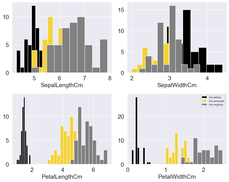
你可以从分布中看到,基于花瓣宽度和花瓣长度,各个类别已经可以相对较好地区分。在另外两个维度上,分布强烈重叠。
这表明花瓣宽度和花瓣长度可能比其他两个维度更重要。因此,如果我只能使用2个维度作为我的模型特征,我会选择这两个维度。如果我们绘制这两个维度,我们会得到以下图表:
不错,我们可以看到通过选择“最重要”的属性,我们可以减少维度并尽可能少地丢失信息。
PCA走得更远,它会对数据进行中心化和缩放,并将数据投影到新生成的维度上。这样,我们不会受限于现有维度。类似于在空间中旋转数据集的3D表示,直到找到一个方向,使我们可以尽可能轻松地分离类别:
import plotly_express as px

color_discrete_map = {iris_data.Species.unique()[0]: "black", iris_data.Species.unique()[1]: "#f3d23a", iris_data.Species.unique()[2]:"grey"}

px.scatter_3d(iris_data, x="PetalLengthCm", y="PetalWidthCm", z="SepalLengthCm", size="SepalWidthCm", color="Species", color_discrete_map = color_discrete_map, width=1000, height=800)

鸢尾花数据集在3D图中的可视化——图片由作者提供
综上所述,PCA转换、缩放和旋转数据,直到找到一组新的维度(主成分),这些维度捕捉原始数据的最重要信息。
可以在Scikit-learn中找到适合将PCA应用于数据集的函数,即sklearn.decomposition.PCA。
7.1 Scikit-learn中的PCA
import numpy as np
import matplotlib.pyplot as plt
from sklearn.decomposition import PCA
import matplotlib
import plotly.graph_objects as go

# Load the Iris dataset
iris_data = pd.read_csv(r'../input/iris-data/Iris.csv')
iris_data.dropna(how="all", inplace=True) # drops the empty lines

# define X
X = iris_data[["PetalLengthCm", "PetalWidthCm", "SepalLengthCm", "SepalWidthCm"]]

# fit PCA and transform X
pca = PCA(n_components=2).fit(X)
X_transform = pca.transform(X)
iris_data_trans = pd.DataFrame(X_transform).assign(Species = iris_data.Species).rename(columns={0:"PCA1", 1:"PCA2"})

# plot 2d plot
color_discrete_map = {iris_data.Species.unique()[0]: "black", iris_data.Species.unique()[1]: "#f3d23a", iris_data.Species.unique()[2]:"grey"}
fig = px.scatter(iris_data_trans, x="PCA1", y="PCA2", color="Species", color_discrete_map = color_discrete_map)

fig.update_layout(
    font=dict(
        family="Arial",
        size=18,  # Set the font size here
        color="Black"
    ),
    showlegend=True,
    width=1200,
    height=800,
)
如果你将前两个主成分(PC1和PC2)的图与花瓣宽度和花瓣长度的二维图进行比较,你会发现数据集中最重要的信息得到了保留。此外,数据被中心化和缩放。
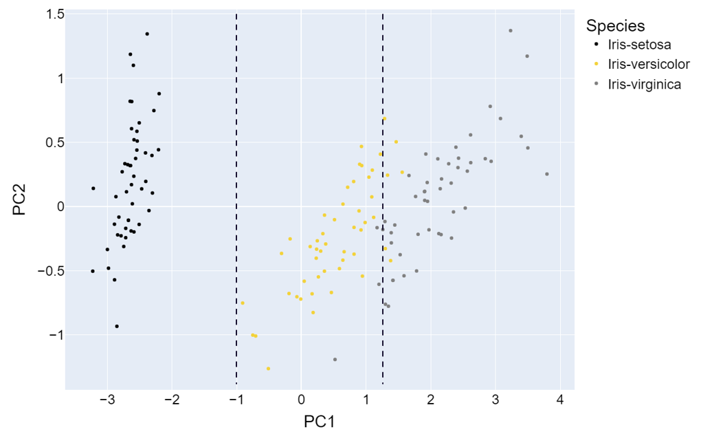
转换后的鸢尾花数据的PCA1和PCA2——图片由作者提供
总结
本文介绍的技术可以应用于任何类型的数据,但不能取代你所从事领域的专业方法。
一个很好的例子是声学领域。假设你对声学和信号处理一无所知……
- 你将如何处理空气声信号,并从中提取特征?
你会想到将信号分解为单独的频谱分量,以了解信号的组成吗?可能不会。幸运的是,你之前的某个人提出了同样的问题,并定义了一些适当的转换方法,例如快速傅里叶变换(FFT)。
借鉴前人的智慧
即使技术已经先进,这并不意味着我们不能利用几十年前的经验。我们可以从过去的经验中学习,并将它们用于使我们的模型构建过程更加高效。因此,如果你想创建有效解决实际问题的模型,花一些时间了解数据所在领域是一个好主意。
继续阅读……
如果你喜欢阅读并想继续阅读有关机器学习概念、算法和应用的文章,你可以在这里找到我的相关文章列表:

机器学习:概念、技术和应用
5篇文章
如果你有兴趣注册Medium获取无限访问所有文章,你可以使用我的推荐链接来支持我。这不会增加你的额外费用,但会给我带来一些小的佣金。
感谢阅读!
参考文献
Box, G E P, and D R Cox. “An Analysis of Transformations.” : 43.
Brown, Sara. 2022. “Why It’s Time for ‘Data-Centric Artificial Intelligence.’” MIT Sloan. https://mitsloan.mit.edu/ideas-made-to-matter/why-its-time-data-centric-artificial-intelligence (October 30, 2022).
educative.io. “Feature Selection and Feature Engineering — Machine Learning System Design.” Educative: Interactive Courses for Software Developers. https://www.educative.io/courses/machine-learning-system-design/q2AwDN4nZ73 (November 25, 2022).```
H2O的特征工程 — Dmitry Larko,高级数据科学家,H2O.Ai。2017. https://www.youtube.com/watch?v=irkV4sYExX4 (2022年9月5日)。
featureranking.com。“案例研究:预测收入状况。” [www.featureranking.com.](http://www.featureranking.com./) https://www.featureranking.com/tutorials/machine-learning-tutorials/case-study-predicting-income-status/(2022年11月26日)。
Geeksforgeeks。2020。“Python | Box-Cox转换。” GeeksforGeeks。https://www.geeksforgeeks.org/box-cox-transformation-using-python/ (2022年12月25日)。
Google Developers。2017。“使用TensorFlow进行特征工程入门 — 机器学习食谱#9。”https://www.youtube.com/watch?v=d12ra3b_M-0(2022年9月5日)。
Google Developers。“介绍TensorFlow特征列。”https://developers.googleblog.com/2017/11/introducing-tensorflow-feature-columns.html(2022年9月21日)。
Heavy.ai。2022。“什么是特征工程?定义和常见问题解答 | HEAVY.AI。”https://www.heavy.ai/technical-glossary/feature-engineering(2022年9月19日)。
heavy.ai。“特征工程。”https://www.heavy.ai/technical-glossary/feature-engineering。
Koehrsten,Will。“手动特征工程入门。”https://kaggle.com/code/willkoehrsen/introduction-to-manual-feature-engineering(2022年9月5日)。
Kousar,Summer。“关于网络安全薪资的探索性数据分析。”https://kaggle.com/code/summerakousar/eda-on-cyber-security-salary(2022年9月7日)。
Moody,John。1988。“多分辨率层次结构的快速学习。”在_Advances in Neural Information Processing Systems_,Morgan-Kaufmann。https://proceedings.neurips.cc/paper/1988/hash/82161242827b703e6acf9c726942a1e4-Abstract.html(2022年11月28日)。
Poon,Wing。2022。“面向机器学习的特征工程(1/3)。 ”Medium。https://towardsdatascience.com/feature-engineering-for-machine-learning-a80d3cdfede6(2022年9月19日)。
Poon,Wing。“面向机器学习的特征工程(2/3)第2部分:特征生成。”:10。
pydata.org。“Pandas.Get_dummies — Pandas 1.5.2文档。”https://pandas.pydata.org/docs/reference/api/pandas.get_dummies.html(2022年11月25日)。
Raschka,Sebastian。“主成分分析。”Sebastian Raschka,PhD。https://sebastianraschka.com/Articles/2015_pca_in_3_steps.html(2022年12月17日)。
Rdocumentation.org。“Boxcox函数 — RDocumentation。”https://www.rdocumentation.org/packages/EnvStats/versions/2.7.0/topics/boxcox(2022年12月25日)。```
Sarkar, Dipanjan, Raghav Bali, 和 Tushar Sharma. 2018. Python实用机器学习. Berkeley, CA: Apress. http://link.springer.com/10.1007/978-1-4842-3207-1 (2022年11月25日).
Siddhartha. 2020. “TensorFlow特征列(Tf.Feature_column)演示。” ML Book. https://medium.com/ml-book/demonstration-of-tensorflow-feature-columns-tf-feature-column-3bfcca4ca5c4 (2022年9月21日).
Sklearn.org. “6.2. 特征提取。” scikit-learn. https://scikit-learn/stable/modules/feature_extraction.html (2022年11月28日a).
spark.apache.org. “提取、转换和选择特征——Spark 3.3.1文档。” https://spark.apache.org/docs/latest/ml-features (2022年12月1日).
Tensorflow.org. “Tf.One_hot | TensorFlow v2.11.0.” TensorFlow. https://www.tensorflow.org/api_docs/python/tf/one_hot (2022年11月25日).
联合国经济和社会事务部人口司(2022年)。2022年世界人口前景在线版。
Valohai.com. 2022. “什么是机器学习流程?” https://valohai.com/machine-learning-pipeline/ (2022年9月19日).
Votava, Adam. 2022. “跟上数据 #105.” Medium. https://adamvotava.medium.com/keeping-up-with-data-105-6a2a8a41f4b6 (2022年10月21日).
Weinberger, Kilian等。2009年。“面向大规模多任务学习的特征哈希。”在_第26届国际机器学习年会论文集-ICML’09_,蒙特利尔,魁北克省,加拿大:ACM出版社,1-8。http://portal.acm.org/citation.cfm?doid=1553374.1553516 (2022年12月25日)。
什么是好的特征?——机器学习教程 #3. 2016. https://www.youtube.com/watch?v=N9fDIAflCMY (2022年9月5日).
Wikimedia. “每个国家的年平均温度.png。” https://commons.wikimedia.org/wiki/File:Average_yearly_temperature_per_country.png (2022年12月25日).
Wikipedia. 2022. “特征哈希。” Wikipedia. https://en.wikipedia.org/w/index.php?title=Feature_hashing&oldid=1114513799 (2022年11月28日).
Zheng, Alice 和 Amanda Casari. 2018. 机器学习的特征工程。
译自:https://towardsdatascience.com/7-of-the-most-used-feature-engineering-techniques-bcc50f48474d


评论(0)